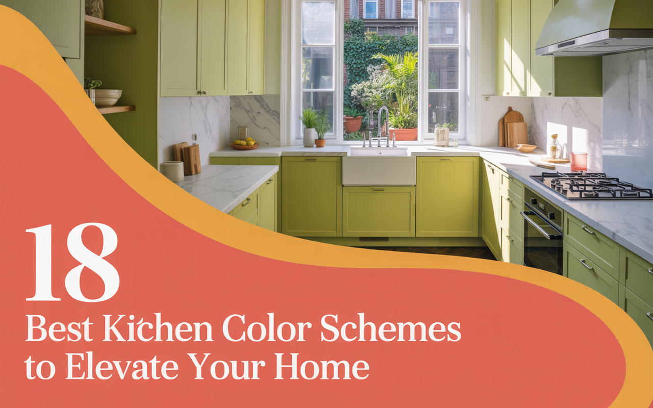
18 Best Kitchen Color Schemes to Elevate Your Home
Color has the power to shape how a kitchen feels. After more than two decades of helping homeowners build spaces they love, I can say with confidence: the right kitchen colors matter more than people think. Not just for beauty, but for comfort, warmth, and the feeling of home. This isn’t about trends that fade. This is about color choices that truly elevate the heart of your home. Here are 18 best kitchen color schemes.
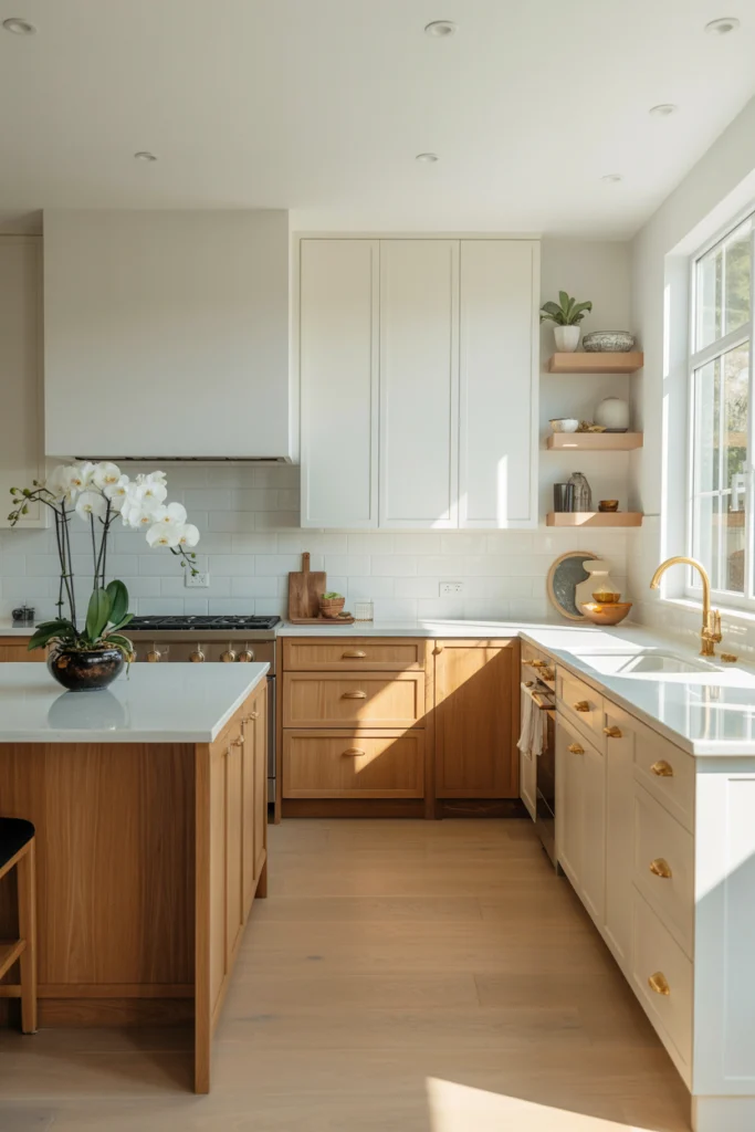
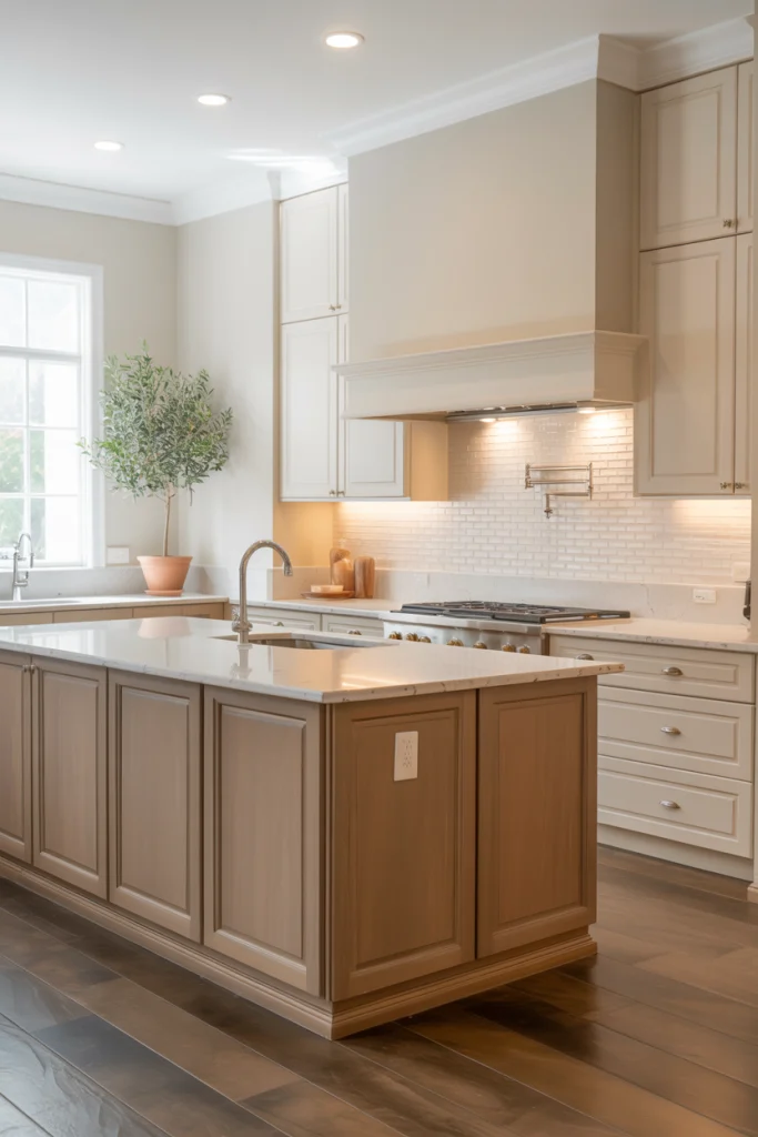
White and Oak for a Clean, Warm Feel:
When you blend white with the soft tones of natural oak, the result is clean and calm. White keeps the space open and bright, while oak brings in warmth without taking over. This pairing works in both small and large kitchens. It helps reflect light, making the room feel spacious, and the oak adds just enough contrast to avoid feeling sterile.
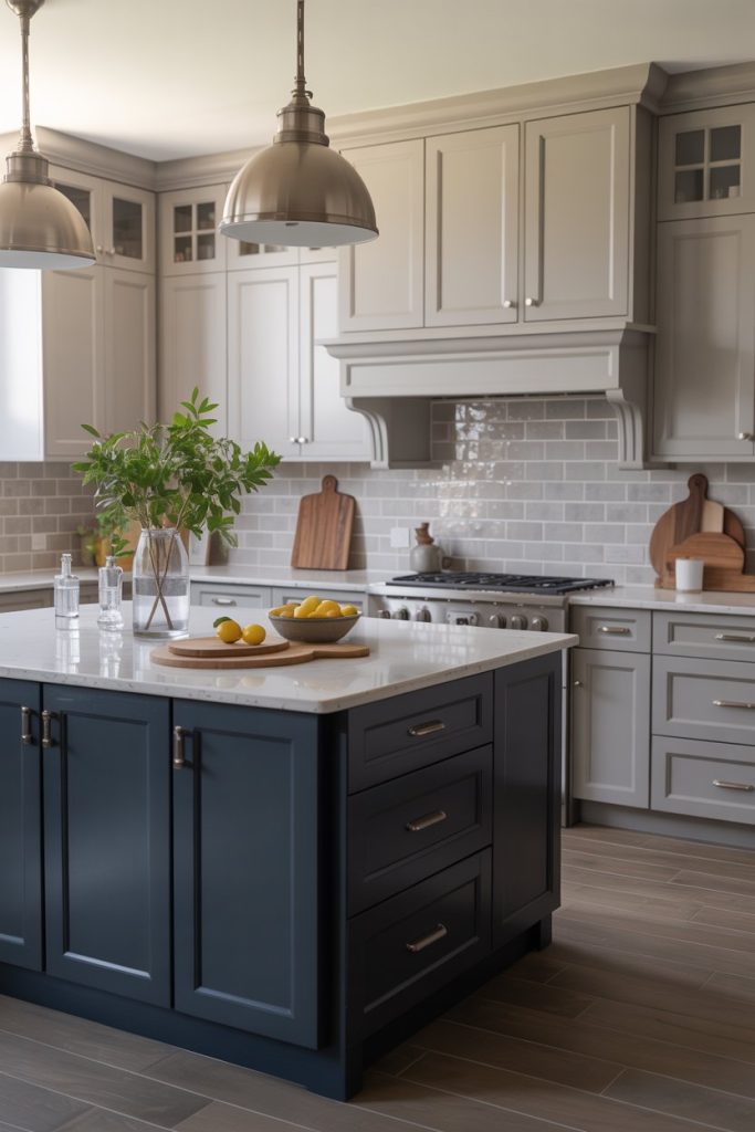
Deep Blue and Soft Gray for Depth and Calm:
A deep, muted blue paired with a gentle gray creates a space that feels both grounded and peaceful. Blue adds richness without being loud. Gray supports it with quiet balance. Together, they bring a steady, confident energy into the kitchen. This palette suits people who want a classic look that still feels fresh.
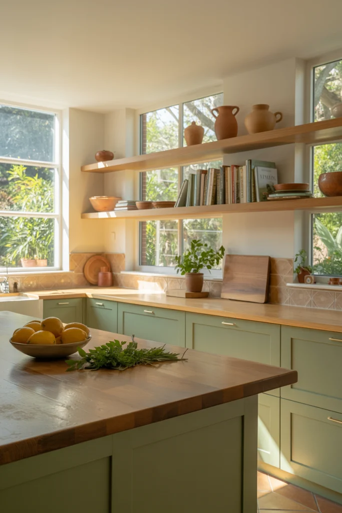
Sage and Linen for a Natural, Gentle Touch:
Sage green is soft and calming. When you pair it with a linen white or warm cream, it feels like bringing the outside in. This combination gives off a sense of ease. It doesn’t try too hard. It simply works. In spaces with wood accents or garden views, this palette blends seamlessly with nature.
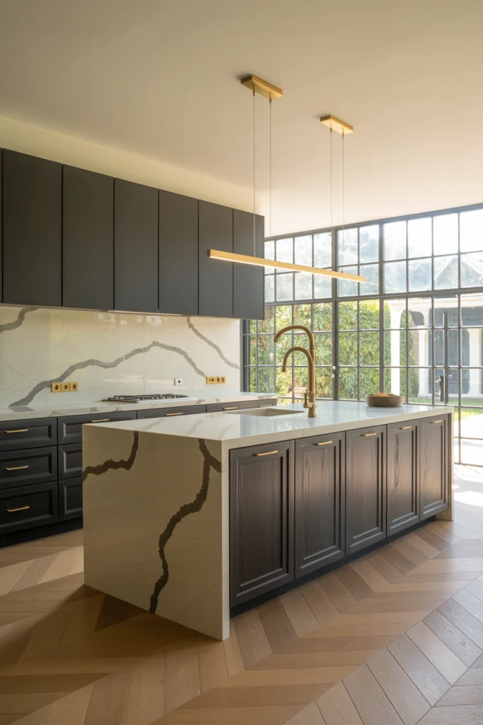
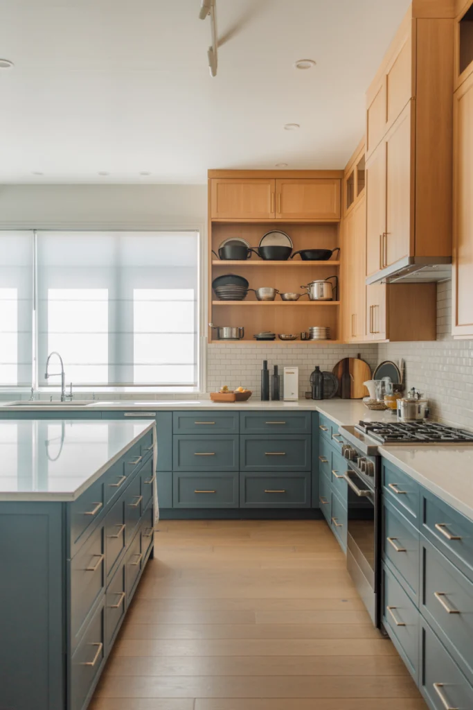
Charcoal and Brass for Bold Simplicity:
Charcoal is strong and steady. It’s a color that can anchor a space. When you add brass, something special happens. The brass brings shine and warmth. The contrast feels bold but not flashy. It works best when used on lower cabinets or islands, with brass in the lighting or hardware for balance.
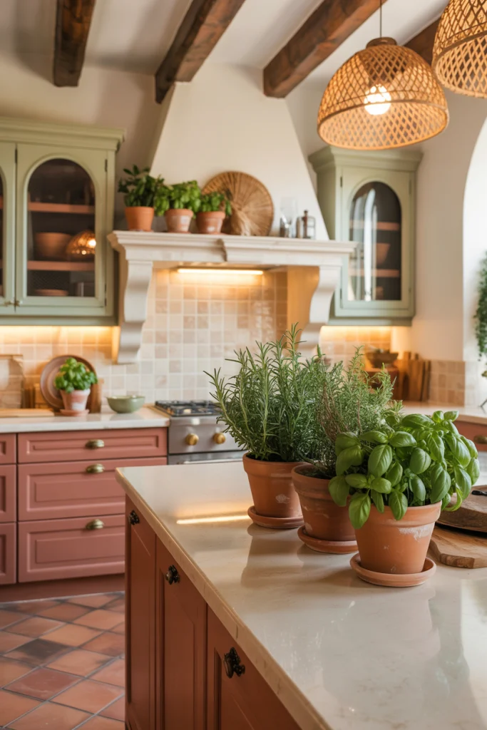
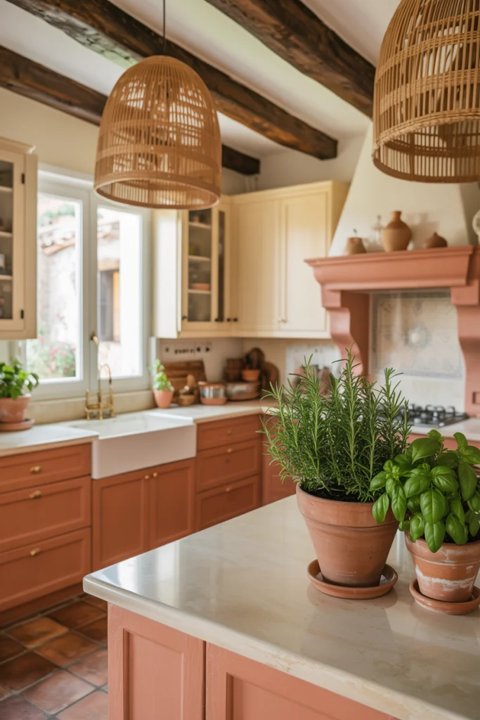
Terracotta and Cream for Earthy Warmth:
Terracotta brings a sun-baked, rich energy to the room. It’s full of personality and charm. When softened by creamy tones, the space stays light and inviting. It feels rooted, like kitchens you might find in older homes or warm climates. The cream gives the terracotta room to breathe.
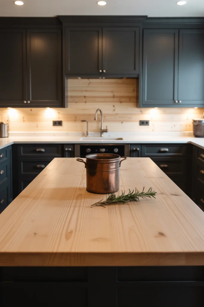
Soft Black and Pine for Modern Grounding:
Black doesn’t have to be cold. When softened just a bit and paired with light pine wood, it creates a modern but approachable vibe. Black brings weight to the room, and pine keeps it fresh. Together, they offer a clean contrast that never feels heavy. It’s strong without being severe.
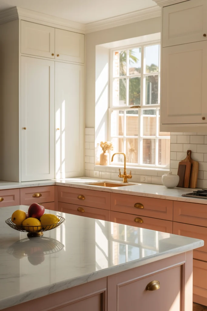
Dusty Rose and White for a Fresh, Gentle Vibe:
Dusty rose is warm, muted, and a little playful. Paired with white, it becomes soft and open. This isn’t a bright pink kitchen. It’s grown-up, elegant, and warm. It brings in a soft blush without overwhelming the space. The white acts like a canvas, letting the rose speak quietly.
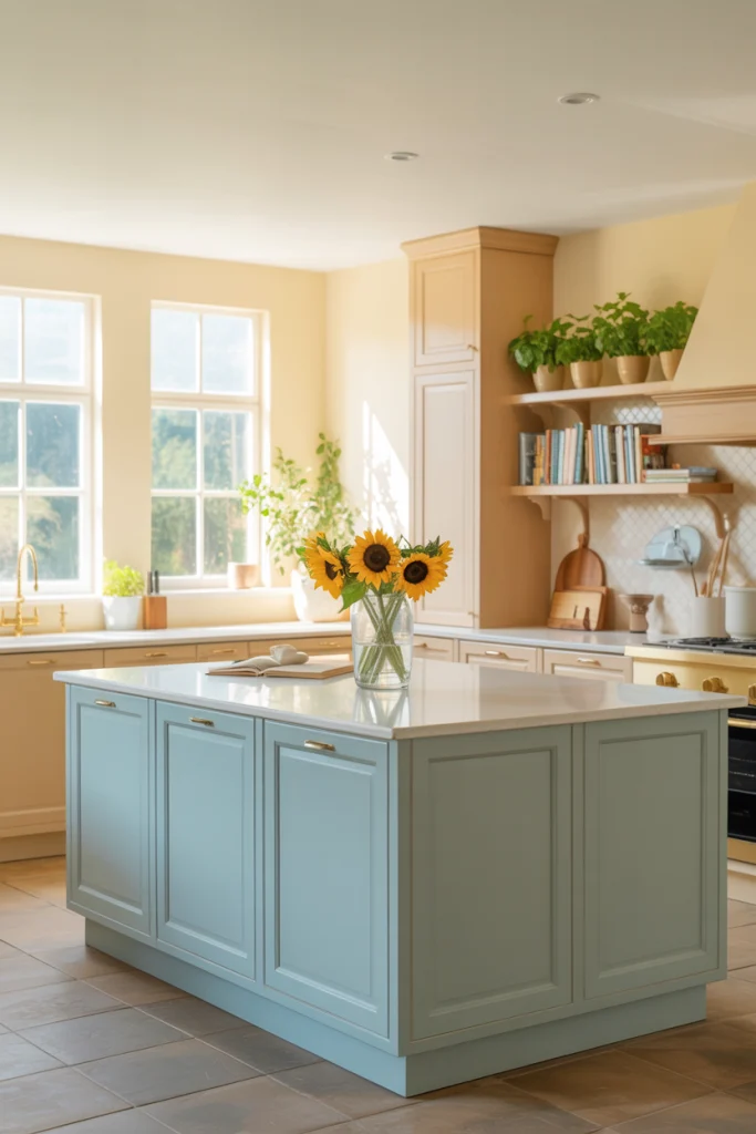
Sky Blue and Sand for Light and Calm:
Sky blue is like a breath of fresh air. It helps kitchens feel wider and brighter. When paired with a sand-colored beige or tan, it feels like the beach or the sky meeting the earth. This combo works well in homes near water or those looking to bring a little calm into their cooking space.
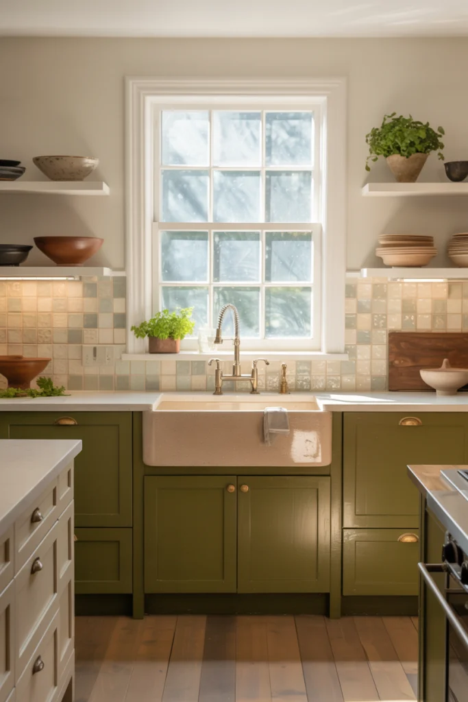
Olive Green and Bone for Subtle Depth:
Olive green has depth but doesn’t shout. It’s earthy and mature. When paired with bone white, the result is smooth and easy. This pairing feels solid and dependable. The olive adds character, and the bone softens it all. It fits beautifully in kitchens with natural stone or brushed metal features.
Steel Blue and Natural Maple for Smart Contrast:
Steel blue brings a quiet boldness, especially when placed against the warm tone of maple wood. Maple has a natural golden touch that balances the cooler tone of the blue. This mix creates energy, but the kind that feels thoughtful. It’s subtle but full of personality.
Warm Taupe and Snow for Timeless Calm:
Taupe is often overlooked, but when done right, it’s incredibly versatile. Its warmth carries the space. Snow white, not too bright, complements it beautifully. This pairing offers a timeless backdrop. It welcomes any style of cabinet or countertop and plays well with stainless steel or matte black finishes.
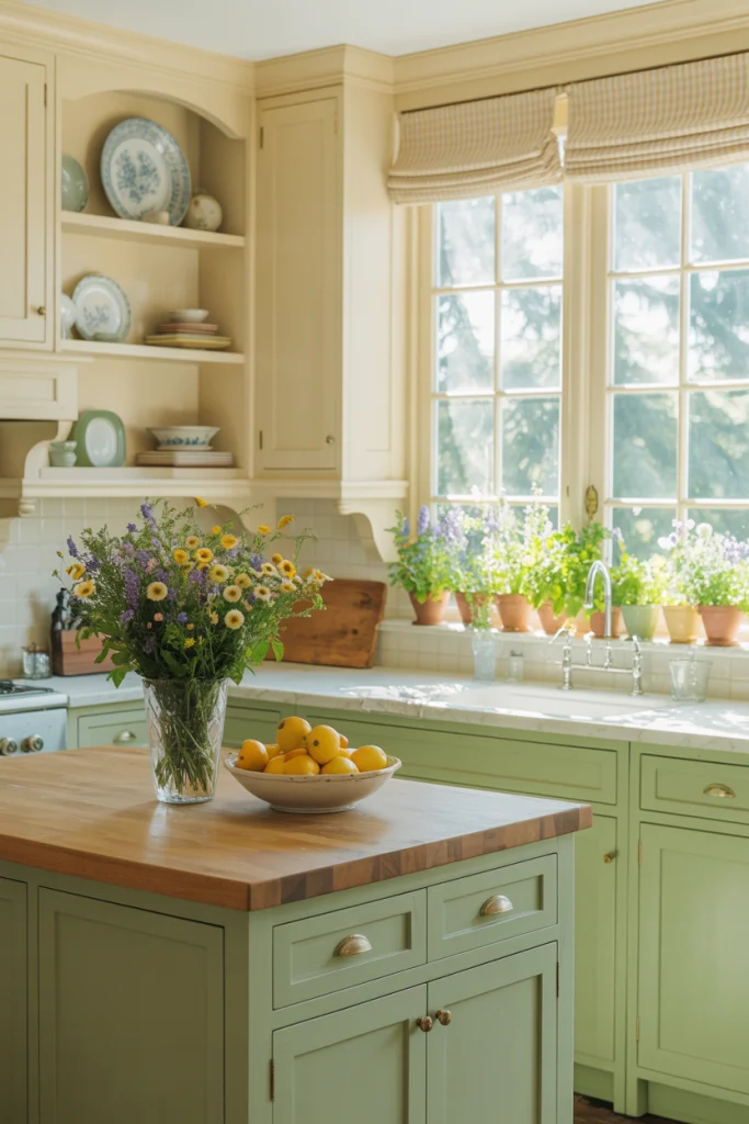
Pistachio and Ivory for a Light, Inviting Look:
Pistachio is soft, happy, and just a bit nostalgic. When paired with ivory, it feels clean but never cold. This is the kind of kitchen color scheme that feels like a morning breeze. It’s especially nice in cottages or older homes that want to stay bright but charming.
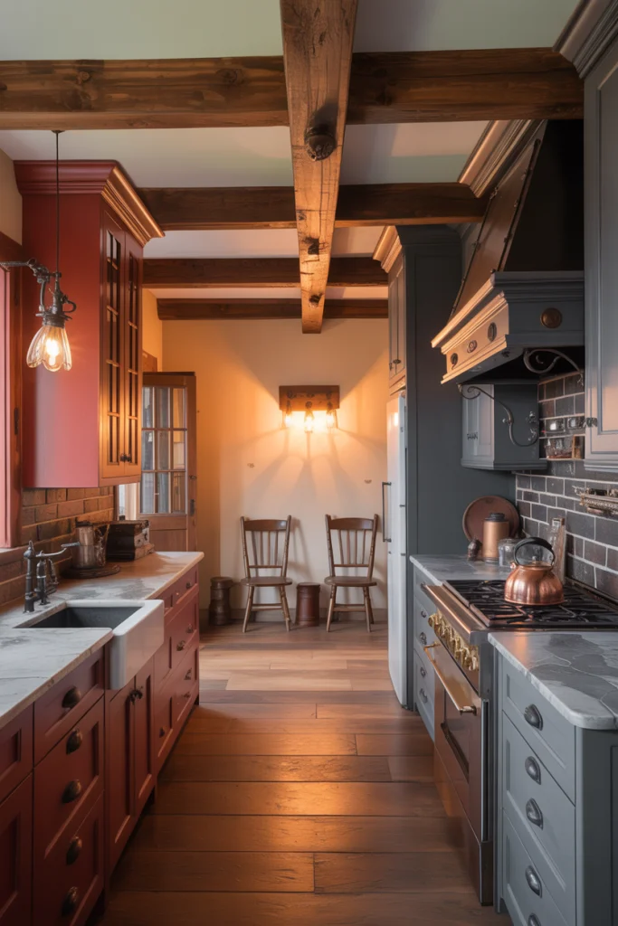
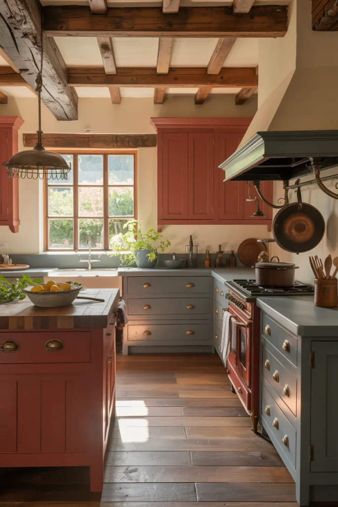
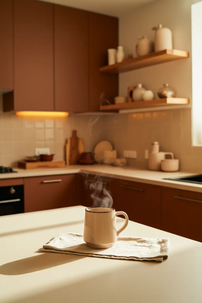
Brick Red and Slate for Rustic Strength:
Brick red has strength and soul. It reminds people of hearths and wood-fired ovens. When balanced with slate gray, the kitchen takes on a rustic character that feels lived-in and proud. This is a good fit for people who want warmth and boldness without going modern.
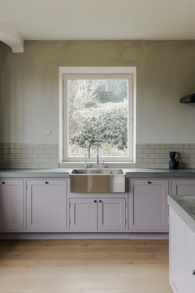
Pale Lavender and Ash for a Whisper of Color:
Lavender doesn’t have to feel sweet. A pale version, almost gray itself, can bring calm and curiosity into the kitchen. When paired with ash gray or even concrete tones, it keeps the room grounded. This is a color scheme for those who want to try something different without going bold.
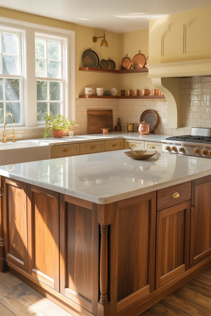
Buttermilk and Walnut for Comfort and Class:
Buttermilk yellow is soft, welcoming, and full of light. When you pair it with the rich tones of walnut, the result is timeless and cozy. It feels like a space meant for Sunday mornings. The walnut keeps it from becoming too bright, and the buttermilk brings a light warmth that’s hard to beat.
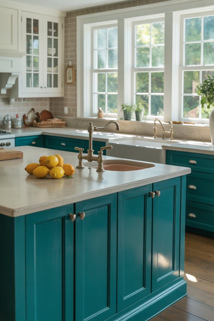
Teal and Linen for Cool Balance:
Teal walks the line between green and blue. It’s bold but calming. When used in moderation and paired with linen white, the space stays light but still feels full of character. This pairing works well in kitchens that have large windows or a lot of natural light.
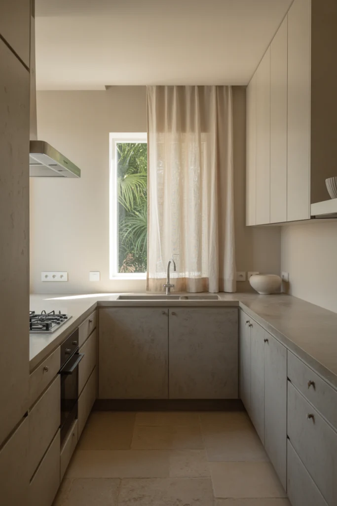
Stone and Fog for Subtle Texture:
Stone gray and fog white don’t just add color—they add texture. These shades feel like natural materials. They create a mood that’s quiet, layered, and thoughtful. This palette works for people who like clean spaces that still feel warm and lived in.
Cocoa and Cream for Sweet Contrast:
Cocoa brown is rich and full. It adds a touch of comfort to any kitchen. When paired with cream, it feels balanced and smooth. This scheme brings depth without darkness. It’s like a warm drink on a chilly day—comforting, inviting, and always just right.
Closing Thought:
Your kitchen doesn’t need to be flashy to be beautiful. It needs to feel right for you. Each of these 18 color combinations brings something unique to the table. They aren’t just design trends. They’re choices shaped by years of experience, by real kitchens, and by the people who use them. Whether you’re painting walls, choosing cabinets, or updating tiles, let your colors support how you live. When color and comfort work together, the kitchen becomes more than a room. It becomes home.